Application layout
Mar 25, 2024 | 2 min read
When first opening the SMS Data Catalogue, the user is sent to the search view.
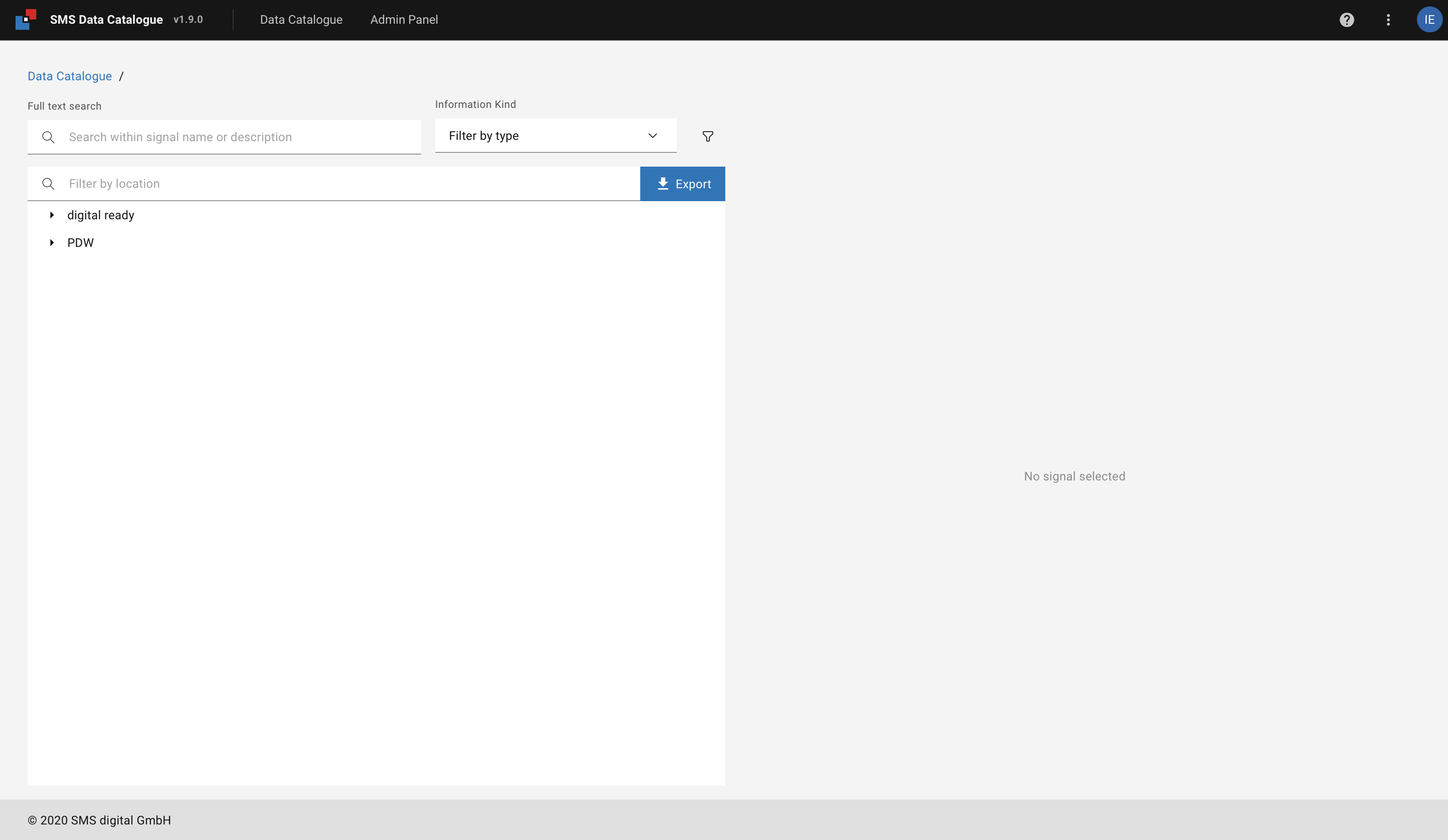
Figure 1 Landing screen when first logging into the SMS Data Catalogue
This view allows the user to navigate through the signals (see Metadata search and Editing of metadata).
In the SMs Data Catalogue UI is split vertically into 3 parts:
UI shell header
A header area, also called horizontal menu bar, is located at the top of every screen (see Figure 2). It contains, from left to right, the following features:

Figure 2 UI Shell Header
Logo, application name and version
Clicking on the Logo, Application name, or version takes you back to the landing page.
Options’ menu
The option’s menu is accessed by clicking on the vertical ellipsis ⋮ icon on the right-hand side of the UI shell header.
It exposes general functions to change the behavior and appearance of the application.
Dark mode allows the user to switch between the themes (see UI themes).
Asset name allows the user to change the location name between Asset tag name and display name if provided.
About provides information about the application and the contact information.
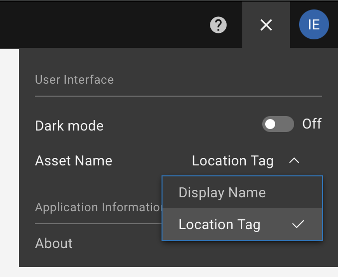
Figure 3 Opened options menu.
You may close the menu by clicking either on the X on the top right-hand side or clicking somewhere outside the menu.
Clicking the ? icon left to the ellipsis icon opens a new tab or window with this user manual.
Footer
The footer area is located at the bottom of every screen (see Figure 4). It contains the Copyright statement

Figure 4 UI Shell Header
Content area
The content is the space between the UI shell header and the Footer. It changes with every screen. Nevertheless, most screens will have a Breadcrumb.
Breadcrumb
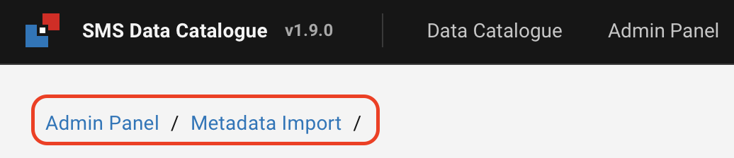
Figure 5 Breadcrumb navigation.
A breadcrumb trail tracks and displays a hierarchy of the current page concerning the application’s structure. It furthermore allows you to navigate the different levels by clicking on the individual items.